
Seeding app monetization with a strategy every team backed
100%
alignment on launch scope across 5 teams
$1+
Start of revenue generation
Beem It (Australia's Venmo, 4.9* app store rating, 3M users) sought to expand from instant peer-to-peer payments to a full digital wallet and monetize their existing passionate user base with e-gift cards & bill payments.
2019 | 4 months | 32 research participants Core team members: 1 UI designer, 1 brand designer, 1 product manager, 4 engineers, COO, Head of strategy & partnerships & myself
-
Led mixed-methods research
-
Aligned 5 teams on launch value propositions
-
Owned end-to-end UX and UI
-
Steered implementation trade-offs
Drove 100% cross-functional alignment on the scope at launch
-
Evidenced unmet customer needs with primary research
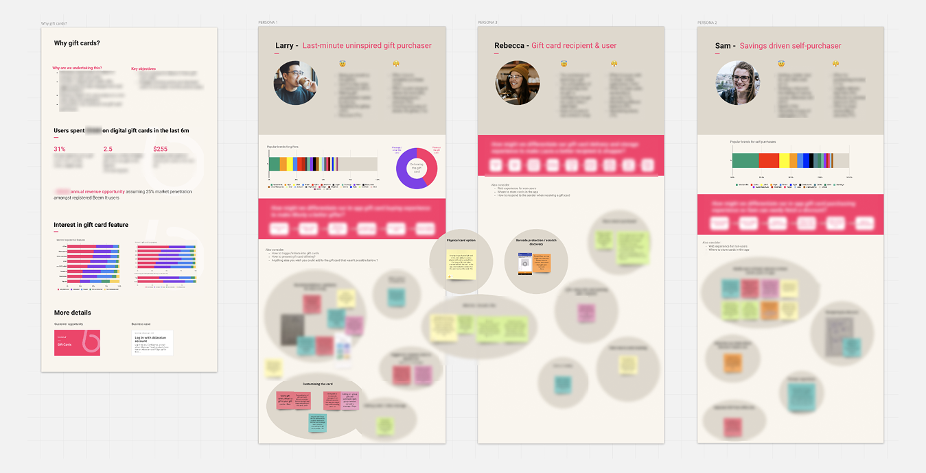
I led & executed primary mixed methods research to map the met and unmet needs in our target market.
'Switch' ethnographic interviews (9) helped us discover the pain points.
Surveys helped us prioritize pain points.
-
Led 5 teams to ideate and align on differentiators
I distilled the research into immediately-actionable customer archetypes. I used them to run ideation workshops with engineering, CS, operations, product & design teams. This accelerated the momentum and propelled the team into action.
We rapidly sketched & designed the key ideas to make them tangible, solidify the alignment and start scoping launch effort.
-
Validated the value propositions
We prototyped the ideas. I led the validation of the designs and their iterations through qualitative testing to ensure the differentiators resonated with our users and had the potential to switch behaviour (20 sessions).
We compiled the feedback in a sizzle reel to get everyone on board.
Turned payment anxiety into trust & confidence
Anxiety about incorrect details
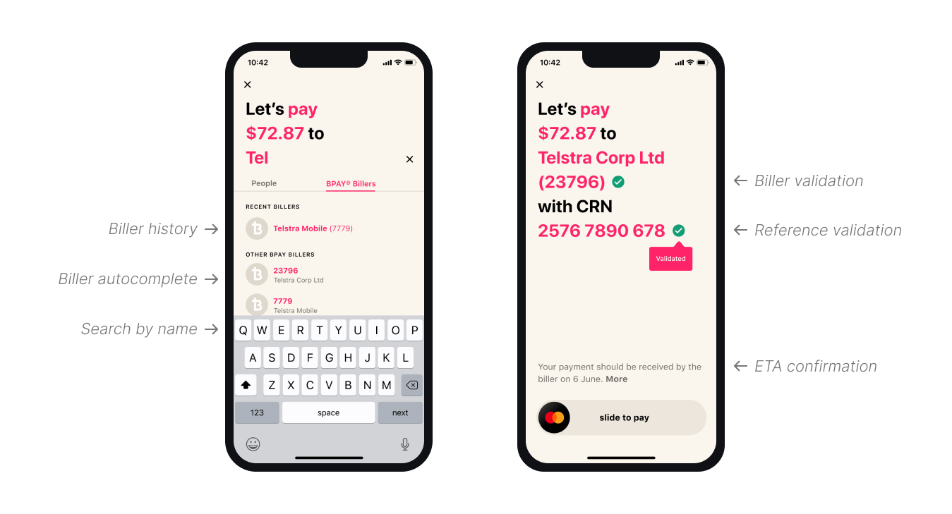
Research into how customers used BPAY (Australian bill payment scheme) surfaced anxiety about entering incorrect bill details.
Validation exists but isn't usually shown
Designing for ease & instant reassurance
We first reduced the effort of entering biller details by enabling search by name/code. We also made the existing trust and verification visible, turning silent back-end safety into felt confidence at the point of need.
Turned e-gift card awkwardness into a thoughtful experience
The quiet discomfort of gift cards
The research with users who bought gift cards before evidenced a tension around digital gift cards: people felt a quiet discomfort offering a gift card instead of a "real" gift, yet still wanted it to land as something significant.
Making a digital gift feel thoughtful with unwrapping, scratching, and a card
So we focused the entire experience on gifting, a natural fit with Beem It's social DNA, where the whole point is making money moments feel warm rather than awkward.
A digital unwrapping moment: including a scratch-card reveal of the brand and amount.
A series of cute, animated e-cards & gifs: people could personalise and combine, so the act of giving felt composed and thoughtful, not transactional.
Held up the design intent against tech reality
Innovating with 3rd parties meant constant technical constraints
As neither product sat on infrastructure we owned, we kept discovering new engineering challenges as the project progressed. Bill payments rode on BPAY rails. Gift cards ran through a white-label processor that managed retailer partnerships, card issuance, and redemption.
Design sat at the table and steered the tradeoffs
My approach was to bring a strong design intent, then negotiate it against what the APIs could actually deliver, keeping the customer outcome at the centre the whole way. For BPAY, we had to decide how to validate the biller codes or the reference number: Check on every keystroke (burning API calls), once at the end, or only past a certain threshold. We landed on an approach that stayed within sensible API limits without sacrificing the reassurance the customer needed.